The Effect of Concentrations of Various Air Pollutants on Cancer Prevalence at the State Level over Time
Anand Rajan (ar4173), Matt Neky (mjn2142), Joe Kim (jhk2201), Alyssa Watson (aw3253), Yoo Rim Oh (yo2336)
Motivation
Project Motivations
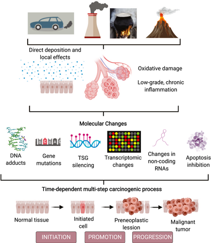
Current research and trends clearly demonstrate that air pollution is associated with the increase in both incidence and mortality for certain cancers. Thus, we will to take a closer look at trends of levels of major air pollutants that are of major public health concern as declared by the WHO: NO2, SO2, CO and 03, and compare these trends to incidence and mortality of lung cancer data by state, with respect to time.
Our motivation for this project is to more robustly investigate the aforementioned theories by further analyzing and evaluating the associations between pollutants and lung cancer at the population level with respect to time.
The implications of such an analysis can provide justification for further research on the effects of major air pollutants on cancer survival and motivate urgency for environmental policy to slow the progression of climate change to improve quality of life and deleterious consequences on population health.
Research Questions
Some initial questions we considered to explore data available:
- What is the relationship between incidence rate and mortality rate of different types of cancer?
- What has been the general trend of cancer incidence, cancer mortality, and pollution levels over time?
- What is the geographical spread of cancer incidence and pollution levels in US?
- Is there any evidence of association between cancer incidence (especially lung cancer) and air pollution?
Data
Data Source
Our project consists of data from two main sources:
Regarding cancer statistics, we retrieved data from American Cancer Society Cancer Statistics Center. Raw data sets were available for download in excel format. The three data sets give us information on aggregated mortality and incidence rates from 2013 to 2017, aggregated mortality and incidence rates of various cancers at the state level from 2013 to 2017, and trends of mortality related to various cancers over time from 1930 to 2018. According to the file and website, the data source is the North American Association of Central Cancer registries.
Cancer Data Code:
Average annual rate per 100,000, age adjusted to the 2000 US standard population.
Incidence/Death Rate Per Cancer Type:
Cancer Type: Type of cancerBoth sexes combined: Combined rate for both female and maleFemale: Rate for female onlyMale: Rate for male only
Incidence/Death Rate Per State:
State: US States includingAll U.S. combinedas an observationFollowing columns for each cancer types:
Both sexes combinedFemaleMale
The second data set is air pollution data in the United States from 2000 to 2016. The data was gathered by the EPA and measures air pollutant concentrations(in ppb/ppm) for major pollutants at the city/county level. This is an extremely large data set with over 174,000 observations. Brief description of the pollution data set
We focused our analyses on the mean values of 4 major pollutants:
- Nitrogen Dioxide (NO2) : measured in parts per billion
- Sulfur Dioxide (SO2) : measured in parts per billion
- Carbon Monoxide (CO) : measured in parts per million
- Ozone (O3) : measured in parts per million
Pollution Data Code:
State Code: The code allocated by US EPA to each stateCounty code: The code of counties in a specific state allocated by US EPASite Num: The site number in a specific county allocated by US EPAAddress: Address of the monitoring siteState: State of monitoring siteCounty: County of monitoring siteCity: City of the monitoring siteDate Local: Date of monitoringFollowing Columns Per Each Pollutant:
Units: The units measured for pollutantMean: The arithmetic mean of concentration of pollutant within a given dayAQI: The calculated air quality index of pollutant within a given day1st Max Value: The maximum value obtained for pollutant concentration in a given day1st Max Hour: The hour when the maximum pollutant concentration was recorded in a given day
Data Cleaning
The pollution data was available for download in a csv format which was uploaded to repo using git LFS due to its size. Then this data was cleaned to have year, state, and the mean values of the 4 pollutants as main variables. Furthermore, observations from Country of Mexico was excluded to match available state data from cancer mortality trend dataset.
pollution = read_csv("data/uspollution_us_2000_2016.csv") %>%
  janitor::clean_names() %>%
  select(state, date_local, no2_mean, o3_mean,
         so2_mean, co_mean) %>%
  separate(date_local, into = c("year", "month", "day"), sep = "\\-") %>%
  select(-c("month", "day")) %>%
  group_by(year, state) %>%
  summarize(across(everything(), mean)) %>%
  mutate_if(is.numeric, ~round(., 3)) %>%
  filter(state != "Country Of Mexico") %>%
  mutate(
    year = as.numeric(year)
  )
Additionally, to explore the relationship among different pollutant levels and cancer incidence, especially lung cancer, another version of pollution data aggregated to have mean pollutant levels from 2013 to 2017 collectively was prepared.
pollution1 =
  pollution %>%
  filter(
    year %in% (2013:2017)
  ) %>%
  ungroup() %>%
  select(state:co_mean) %>%
  group_by(state) %>%
  summarize(
    no2 = mean(no2_mean),
    o3 = mean(o3_mean),
    so2 = mean(so2_mean),
    co = mean(co_mean)
  ) %>%
  mutate_if(is.numeric, ~round(., 3))
All cancer related data from the Cancer Statistics Center were all available in excel format for download. In order to match the time period of the pollution data containing observations from 2000 to 2016, the mortality trend data was cleaned to have observations from 2000 to 2016 only as well. Moreover, our function remove_note allowed cleaning observation points with notes added to only have the numeric value.
read_death_time =
  read_excel("data/DeathTrend.xlsx",
             skip = 6) %>%
  janitor::clean_names()

x = c("colorectum_female", "colorectum_male", "liver_and_intrahepatic_bile_duct_female", "liver_and_intrahepatic_bile_duct_male", "lung_and_bronchus_female", "lung_and_bronchus_male", "ovary_female", "uterus_cervix_and_corpus_combined_female")

remove_note = function(column_name) {
  read_death_time = read_death_time %>%
    separate(column_name, into = c(column_name, "note"), sep = "\\-") %>%
    select(-note)}

for (i in x) {
  read_death_time = remove_note(i)}

death_time =
  read_death_time %>%
  filter(year %in% 2000:2016) %>%
  select(-c("breast_male", "ovary_male", "prostate_female","uterus_cervix_and_corpus_combined_male")) %>%
  mutate_at(vars(-("year")), as.numeric) %>%
  mutate(year = as.factor(year))
Cancer incidence and mortality datasets per state and per cancer types were similarly cleaned to have only the numeric observation values. More specifically for data per cancer type, the incidence rates for the Colon (excluding rectum) and Rectum were excluded to match similarly formatted death rate per cancer type dataset. Also, observations for Puerto Rico were excluded from incidence and death rate per state dataset to match the state variable available in the pollution dataset.
inc_cancer =
  read_excel("data/IncRate.xlsx", sheet = "All US",
             skip = 6) %>%
  janitor::clean_names() %>%
  mutate(
    male = if_else(male == "n/a", "0", male),
    female = if_else(female == "n/a", "0", female)
  ) %>%
  separate(both_sexes_combined, into = c("both_sexes_combined", "note"), sep = "\\-") %>%
  select(-note) %>%
  mutate_at(vars(-("cancer_type")), as.numeric) %>%
  filter(cancer_type != "Colon (excluding rectum)",
         cancer_type != "Rectum")

inc_state =
  read_excel("data/IncRate.xlsx", sheet = "State",
             skip = 6) %>%
  janitor::clean_names() %>%
  separate(
    col = breast_both_sexes_combined,
    into = c("breast_total", "female_breast_only"),
    sep = "-"
  ) %>%
  mutate(
    breast_male = if_else(breast_male == "n/a", "0", breast_male),
    cervix_male = if_else(cervix_male == "n/a", "0", cervix_male),
    colon_excluding_rectum_both_sexes_combined = if_else(colon_excluding_rectum_both_sexes_combined == "n/a", "0", colon_excluding_rectum_both_sexes_combined),
    colon_excluding_rectum_female = if_else(colon_excluding_rectum_female == "n/a", "0", colon_excluding_rectum_female),
    colon_excluding_rectum_male = if_else(colon_excluding_rectum_male == "n/a", "0", colon_excluding_rectum_male),
  ) %>%
  filter(state != "Puerto Rico") %>%
  select(-c("female_breast_only", starts_with("colon"), starts_with("rectum")))
These cleaned up datasets were further wrangled as needed for analysis.
Exploratory Analysis
To explore our initial research questions, we started with visual representations of each data and examining for any noticeable patterns.
For visual plots, check out Exploratory Analysis!
To understand the pollution-related factors that act upon cancer incidence and death, we obtained, cleaned, and analyzed pollution data that spanned from 2000-2016. To begin, we explored the pollution data set. This data contained concentrations from the known pollutants NO2, O3, SO2, and CO. In the first table under the “Exploring Pollution Data Set” section, you can see the average concentrations of each pollutant in question in the United States for each year over the 17-year span. Below that, we have included another data frame with basic statistics for each pollutant type across the entire 17-year span. The purpose of this data frame was to look at the center and spread for each pollutant. Moreover, to compare the distributions of the pollutants to each other, we created a series of boxplots. As you can see, NO2 has the highest average concentration of any of the pollutants in ppm, and also has a skewed-right shape. CO and O3 have much narrower distributions (in addition to much lower mean concentrations), making their shape harder to discern. SO2, however, appears to be approximately normally distributed. The next plot we created shows the US pollution concentration with respect to time. This plot reveals that while NO2 and SO2 have been decreasing in concentration in recent years, that CO and O3 have remained relatively stable. After analyzing the pollution data, we moved onto exploring the lung cancer data sets. From this portion we wanted to not only look at trends in lung cancer incidence and death rate, but plot these indicators against pollution concentration. For our initial exploration of lung cancer incidence, we created an interactive, heat map that showed the distribution of incidence across the United States from 2013-2017. From the map, we saw that southern and north Midwestern states tended to have higher incidence of cancer over this time, while western states tended to have lower incidence rates.From there, we went on to create a similar map with lung cancer mortality data. From the map, we saw a similar distribution across states as the incidence rate. Additionally, we plotted mortality rates over time. The first plot doing this shows the death trend in lung cancer over the same period of time as the previous plot of pollutants. As can be seen, mortality due to lung cancer, for both male and female, has sharply decreased from 2000-2016, which is similar to the trend we see in NO2 and SO2. The next series of plots compares the pollutant concentration to the lung cancer death rate, stratifying by gender. 6 of the 8 plots show a positive, linear relationship between the pollutant concentration and death rate. Specifically Carbon Monoxide, Sulfur Dioxide, and Nitrous Dioxide showed strong positive linear correlations to lung cancer death rate, among males. The 2 plots are the exception are both for O3, which shows a negative, linear relationship with death rate.
The interactive dashboard of Pollution By State explores the distribution of the mean pollutant concentration for each of the 4 main pollutants of interest, NO2, SO2, O3, and CO, across US in 2013-2017. Some state data points are left empty as the raw data contained some missing values.
Regression Analysis
To further understand the the relationship between lung cancer incidence and pollutant concentration, we conducted a regression analysis. We constructed a linear model that utilized aggregated pollutant concentration data for each state from 2000 to 2016 for each pollutant type (so2,co,o3, no2) as predictors and lung cancer incidence(per 100,000 persons) as the outcome variable. Through the model we wanted to see whether specific pollutants were significant predictors in explaining lung cancer incidence throughout states in the US.
To achieve this we first merged the aggregated pollution data set with the lung cancer incidence data set by state. After the data set was created, we explored the relationship between Lung Cancer incidence and each pollutant type to see if there were an strong linear correlations. By utilizing a for loop, we created scatter plots that plotted pollutant concentration vs. lung cancer incidence. From analyzing the scatter plots, we concluded that none of the pollutants had a significant linear correlation with lung cancer incidence. This was the first troubling sign during model construction. Ideally, a linear model that has strong predictive accuracy will have continuous predictors that are strongly linearly associated with the outcome variable. Despite this, we continued on with the model analysis and included all the pollutants as predictors. After fitting the model, we ran basic model analysis.
We found that only two of the beta coefficients (so2 and no2) had significant p-values. Moreover, the estimates for these predictors are interpretable. The estimate for no2 indicates that as notrogen dioxide pollutant concentration increases, the incidence of lung cancer decreases by 1.034 on average. Whereas the estimate for sulfur dioxide indicates that as sulfur dioxide pollutant concentration increases, the incidence of lung cancer increases by 4.561 on average. Though we interpreted the estimates, the overall prediction accuracy of the model is low. Further analysis shows that R^2 = 0.221. This indicates that 22.1% of the variation in lung cancer incidence is explained by the model. For a linear model, the r^2 value is quite low. A low r^2 value along with only two significant predictors indicates the model fit is quite poor overall. The one positive note for the fitted model is that the overall p-value of the model (p-value=0.041) is significant under the threshold of alpha-level = 0.05. Before we continued on to cross validation, we had to verify the model did not violate any assumptions. Thus we plotted predictions vs residuals. From the plot we found that there was no particular trend in the residuals, but rather random scatter. Thus the assumption of homoscedasiticity was held.
To further analyze the model fit, we conducted a cross validation of the model vs comparison models that contain different subsets of the predictors. We created two comparison models. The first comparison model included o3 and so2 as predictors because those two predictors indicated weak positive linear relationships between concentration and incidence, based on both their individual scatter plots and the fitted model. The second comparison model included no2 and co as based on their scatter plots and the fitted model indicated weak negative linear relationships. Once the models were created, we did the cross-validation and generated a box plot that compares the RMSE values between each model. From the box plot, we see the original fitted model performed the best under cross validation as it had the lowest mean RMSE . However, overall the RMSE values for the models were quite high indicating model fit is quite poor.
The final step in our model analysis was to stratify lung cancer incidence by gender to see if this improved the model fit. After running analysis for both models, we saw there were no significant improvements. Many of the coefficients in both models were insignificant, and there were no improvements in r^2 values. If we ran cross validations, I predict we would see similar high RMSE values like for the fitted model.
Discussion
In light of our exploratory and regressed analysis, we attained the following insights:
The goal of this project was to investigate how air pollutants, a modern concern because of climate change, affects incidence and death rates of cancer. To do this, we obtained publicly available data sets that we cleaned and merged where necessary to be able to produce descriptive statistics, plots, and linear models regarding pollutants, cancer, and their relationship. We began by comparing the distributions of pollutants by state (seen in the dashboard) with incidence and mortality of lung cancer. From the distributions of the interactive maps, we saw that the states that had the highest incidence/mortality rates for lung cancer were the northern Midwest (Ohio, Indiana, Michigan) and southeast states (Kentucky, Alabama, Tennessee, Mississippi, Oklahoma). When comparing this map to distributions of each pollutant, we did not observe a similar national pattern. Given these inconsistencies, having more specific data that provides greater depth such as urban vs rural characteristics or county level information may result in clearer insight on this relationship.
Our exploratory analysis also showed that NO2, CO, and SO2 all have positive, linear relationships between their concentration in the environment and cancer death rates. Despite seeing these positive linear associations, we can not draw firm conclusions about the relationship between lung cancer mortality and pollutant concentration. We hypothesize that lung cancer incidence in more strongly correlated with air pollutant concentration compared to morality rates because mortality rates are likely influenced by other social factors (socio-economic status, access to healthcare, etc.). While we would have like to explore this theory, our incidence data could not be merged with our pollutant data because the incidence data had no time variable. Seeing these relationships naturally plotted leads into the building of linear models. However, our models did not show strong relationships between any of the pollutants and lung cancer incidence. This indicates that the models we built are not efficient at accounting for the error in lung cancer incidence, and is therefore a poor tool to use for predictability. The plot of residuals vs. predictions shows a random and approximately evenly distributed about zero, showing that homoscedasticity has not been violated. The boxplots of RMSE vs. model show the fitted model has the lowest mean of the three, however, its mean of 10 is still not optimal, and the overall predictive accuracy of the fitted model can be concluded to be low. Finally, we stratified by gender and built new models. These models also had low R-squared values and cannot be viewed as strong tools for prediction of lung cancer incidence.
Though we were able to create an assortment of insightful visualizations, there were many obstacles that we encountered that prevented us from deriving concrete conclusions about the relationship between pollution and lung cancer. However, lung cancer remains as the leading cause of cancer related deaths, and exploring as many possible contributions to its prevalence is critical in future public health research and policy.
Limitations and Challenges
When cleaning the data, it became apparent that some of the analyses we intended to do were not possible. For instance, not all of the data sets we obtained had time variables, so they could not easily be merged with the pollution data set (which had a range of data from 2000-2016) to create plots comparing either incidence or death, or creating linear models. Because of this limitation that emerged from lack of a time variable in all of our original data sets, we could not explore every possible model we were originally interested in. Additionally, many of the data sets had text notes accompanying the numeric entries saying that data collection practices were altered starting a certain year. Because of this, it is not entirely clear how reliable and consistent all of the data points are, since government collection practices of data do not appear to be standardized even within a single state. Another limitation is data that appears to have flaws, but cannot be verified. For instance, certain data sets we worked with had variables for a certain type of cancer separated out by male, female, and then the total. However, the total did not always equal the sum of the male and female columns, which raised questions about the reliability of the data sets. Given the complexity of the epidemiology of lung cancer, we did not have the necessary measures to stratify our data to account for known social-economic variables that contribute to lung cancer incidence and mortality. In future studies, we could explore how income level, access to healthcare, and urban vs rural (measures of SES) contribute to the relationship between air pollutant concentration and cancers.
If we were the continue on with this current analysis, some things we would do differently are …
- We would create more models looking at different cancers.
- We would conduct statistical testing such as running ANOVA tests to test the significance of the
relationships being explored.